
SightLife Data: Turning Data Points into Human Stories

Project Overview
The following is the capstone project of my undergraduate experience at the University of Washington's Information School. I was part of a team, sponsored by SightLife. We met with our sponsor on a weekly basis over the life of the project to design an information solution, in this case: an information visualization tool. We wanted to work with a sponsor to get experience working with a client and to work with a nonprofit.
Deliverables: Project Plan, Strategy Brief, Design Blueprint (personas, storyboards, wireframes, prototypes), Pitch Video, Production Reports, Mentoring Reports, Usability Testing Report, Poster, Budget Report, Terms of Use, Privacy Policy, GitHub Repository
~18 weeks with each team member taking a full school load
Mayowa Aina, Project Manager
Yvonne Ingles, Designer
Domenica Mata Rodriguez, Developer
Sarah Stanton, Developer
Project Description
Successful data communication inspires action. In India, where nearly half of the world’s corneal blind population lives, policy makers must be persuaded to implement policy change to more efficiently treat these citizens. Sponsored by SightLife, SightLife Data is an information visualization tool that dynamically demonstrates the potential impact that policy change can have. SightLife will be able to use this site to create advocates and inspire policy change that will help the organization accomplish their mission of eradicating corneal blindness worldwide by the year 2040.
Project Promotion
We created the above pitch video and project summary to be showcased in the iSchool Capstone directory. The poster (right) was displayed during project night for other students, faculty and community members to view and ask questions about the project. These deliverables provide the high level problem and solution.
Continue on to read about the process behind the project.
The Process to SightLife Data

*IHME stands for Institute for Health Metrics and Evaluation
Research
Most of the information for this project came from conversations with our sponsor, the SightLife website, and from the spreadsheets of data collected by our sponsor. Before our initial meeting we each did our own background research on SightLife by combing the internet.
As a class assignment we did landscape research where we identified 10 competitors and 10 issues. We created a 10 by 10 matrix and answered the following questions:
- How did each competitor solve each issue?
- What is the benefit of solving each issue?
- How is the competitor different from others?
Doing this landscape research exposed us to how other organizations who dealt with health data presented their findings.
Personas
Initially we came up with 3 personas: Health Officials, Corneal Surgeons, Private Eye Banks/Eye Care Centers. We wrote the personas together and then presented our initial personas to our client. There was a little editing and we also added 2 more personas: Eye Bank Associations and an anti-persona, a Potential Donor. The following are some of the bullet points from the comprehensive Strategy Brief deliverable that was presented to the client:
National/State Health Officials
- persuading and inspiring these users is key to moving the needle on policy within their respective regions, and the nation.
- easily digestible information that can be communicated quickly and efficiently.
- physical artifact as a reference material
Corneal Surgeons
- will become empowered with the data that they need.
- use the information to accomplish their goals including increasing access to follow-up care, increasing access to tissue, and increasing access to skill development.
Eye Bank Association
- potential evangelizers in support of policy change, they can use the information and share it within their own networks to move the needle on policy change that that would benefit their individual missions as well.
- interested in applying the tool to work done in other areas with audiences that may differ than the primary audiences listed here.
Private Eye Bank or Eye Care Center
- private or public organizations that receive assistance and/or are in a partnership relationship with Sightlife.
- With the right data, Sightlife and their representatives create evangelizers out of these users who can reach to their own network of hospitals or contacts which may in turn help inspire the policy change needed to expand access to transplants.
- interested in improving the infrastructure around eye banking
Potential Donor
- not a key audience for the proposed data visualization tool, however, they may stumble upon the tool.
- key to the corneal transplant process, but do not have direct impact on current or future policy.
- usually citizens that have disposable income who would like to contribute to their local community. They like to know that their donations will have an impact.
Storyboard Design Exercise
We did a design exercise where we each did a storyboard of how the different personas would use the tool we would be designing.
These sketches illustrate the steps of what we thought an official would do to use the tool in real life.


Storyboards
These were the final storyboards after revising the initial sketches we shared with the client .


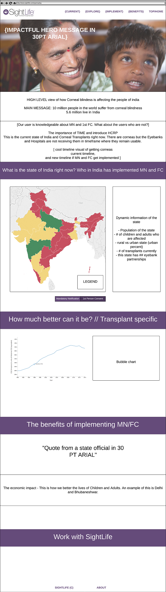
First Wireframe
Our wireframe is of a data visualization for SightLife that demonstrates where mandatory notification policy is implemented in each state in India. It is important to SightLife that the visuals produced are available online in an interactive format, and also able to be printed out for the convenience of our audience.
When coming up with a prototype we had to assume some aspects that needed to work accordingly. These risky assumptions are:
- Taking input from the user and generating the visuals
- Accuracy of the model
- Model: calculating in the background
- Visual: making sure the ranges used don’t skew the data because it’s dynamic
- Algorithms to determine the ranges to display of the data
- Producing a visualization that can be both interactive online as well as printable
- Users understand the purpose of the visualizations


This wireframe was done in a 20 minute brainstorm session in class.
Looking back: The map would become the biggest challenge of this project: from figuring out what platform to build the map, what colors to use, and how to accurately and dynamically display the spreadsheets of data we had. We at one point wanted to scrap it all together, but the alternative (drop down menu) was unintuitive and a less interesting way to display data. We made a prototype with a drop down menu and during usability tests determined that users found it not actionable.
Revising our Wireframe
After creating our first wireframe, we had to find another group in the class to give us feedback. After receiving their feedback we revised our initial wireframe with their suggestions and concerns. This was our first usability test.
Feedback received with the changes made:
- Confusing when selecting the state to view at the same time as selecting policy level
- Revision: Show all states initially with each state color coded to represent if policy was implemented, in progress of being implemented, or no policy in place.
- At this stage we were also toying with the idea of a categorical or continuous map
- Map size is too small, might be nice to include state names on map
- Revision: Make map area bigger and clickable with state names for those unfamiliar with India
- This requires making the visual interactive as well as taking user input
- Branding to provide users with knowledge that using this is safe and precise
- Revision: Added the SightLife logo and description text describing the tool


Adding to our initial design
At this phase of the project, we wanted to allow the SightLife staff to upload their spreadsheets to create visualizations that could be presented to policy makers. The map that we created at the beginning would be the overall example used to show where policy was currently implemented. However, the data used in creating that map was only a portion of the data available to us.
We envisioned a data portal where the user could upload data, create visualizations, and save them or print them for later usage.


User Dashboard/Data Portal
User dashboard for creating visualizations: This whiteboard illustrates a user dashboard for SightLife staff users so that they can develop and create unique visualizations for presentation and advocacy purposes. Whiteboard components include:
- Landing page where the user logs in
- Dashboard with options to retrieve previously made visualizations or generate a new visualization
- Clicking to view previous visualizations will take the user either to the specific visualization clicked on or a preview list of all visualizations created.
- Generating a visualization allows a user to fill out a form like with several steps including unique variable input. Once completely filled out the user can preview the visualization and determine whether or not to save it or edit it.
- Once saved a visualization can be formatted for a presentation mode or downloaded to be included in print materials by retrieving it from saved options.
Template
Print template: This whiteboard describes a template that SightLife staff users can utilize which populates a tear sheet with the visualizations created by the user.
- The template on the left is designed for SightLife staff users to be able to easily create presentation materials that are effective and communicative for desired audiences.
- The template on the right is designed for visitors and other users of the tool who may arrive at the tool through indirect means or are interested in how SightLife visualizations are created
Looking back: The data portal and allowing for visualization creation was highly ambitious given our timeline. We spent some time contemplating the design and even added a walkthrough of the visualization creation (below). This was a design that would have left the sponsor with a tool that would have taken data, created visuals, and put them into a template that could have been presented.


Walkthrough Whiteboard
Through another iteration we added a walkthrough for a visitor to the public site. It would take the user through a successful case study of policy implementation in Delhi. This was to incite interest in policy implementation and to be used as an onboarding tool for internal staff.
second Wireframe
In preparation for a second design meeting with our sponsor, a second wireframe was built. It took elements from the first wireframe and the walkthrough aspect from our subsequent whiteboard design session. At this point in time, we agreed that a database, for user accounts, would require internal work that we weren't confident could be done in the amount of time we had.


The wireframe had a more refined map area with the option to view different years of policy implementation (allowing he user to see past, current and possible future implementation numbers) and to toggle between the two policies of mandatory notification and 1st Person Consent. Two different calls to action were added: creating a visual and learning more about working with SightLife.
MAJOR DESIGN CHANGE and Usability Testing with our peers
After feedback from our client, we decided to simplify the design: we got rid of generating a data visual (Screens 2 and 3 from above) and a separate page to view current and future data projections of a state (Screen 4). We got rid of the map and wanted to test the feedback of using dropdown menus. From a develop implementation standpoint it would be quicker and easier to create.
We showed two versions of the simplified site, the first version had a world homepage, then the user would have to select India. In the second version the user would already start at India. Some of the questions we asked were: open general questions about the look of the website, What they thought the menu terms, What they thought of how to select a country/state and what would happen after selecting.

Some of the Feedback:
- Nice big pictures
- Middle icon is confusing
- Information in the middle is good
- The calls to action are small
- Want the selected country/state to load in the page instead of being taken to another
- Make the flow to the case studies cleaner
- Drop downs are not stimulating
Feedback response and intended implementation:
- Include more summary information about SightLife goals
- Include a way to link back to previous pages
- Stronger call to action
- Page movement, to increase likelihood of scrolling
- Open state page as ui-view on country specific page
- Include more visuals and less text if possible using infographics
- Select using a map instead of a drop down menu
Mentor Session with a person in industry
We showed a mentor the above pages and received high level feedback.
Summary of issues raised:
- Information prioritization and layering: We need to be very clear about the main take away and messaging of the product and stop burying the information.
- Users tend to gloss over or get overwhelmed by information in a dropdown
- She also gave us some tips about the content itself and playing with text size to make sure that content has space to breathe
Our mentor also talked about the sponsor-team relationship and how to get the most out the time that our sponsor has allotted to this project as well as allowing ideas to “marinate” with the sponsor/client. She also helped us consider our content strategy and how best to utilize the data and information we had instead of trying to work with information that we didn't have or would need. We also talked about how to prepare the end of our time with the project by leaving the organization with a strategy rather than designs.
Updating our design
Ultimately, we decided on a one page design and went back to focusing on the interactive map. We also considered the following:
- reduced number of menu items
- introductory text centered around India with SightLife's goals
- separate the sections with a question that will be answered in that section
- a map instead of a drop down menu to select states in India
- a dynamic text box and line graph that will respond to which state is selected
- a call to action to contact SightLife
In this part of the design process there are five key sections:
- Corneal blindness and policy implementation
- to give background information
- brief overview
- The current state of India (map) and the ability to click individual states
- more interesting than drop downs and provides context
- quick way to look at the state of the country
- How much better can it be (with policy implementation)
- policy implementation data in an easily digestible format
- The benefits of implementing policy
- overview of how the people and society benefit
- Contact SightLife
- call to action
Usability testing with our sponsor
We presented this new one page design to our sponsor and two other members of SightLife who were seeing this project for the first time. We asked for general feedback as they scrolled down the page, letting them speak out loud. We asked for specific feedback about the menu terms used, and the look and feel of the map.
Some of the feedback:
- instead of a top menu, a menu that indicates where the user is on the page
- the top menu made it seem like a new page was being opened
- the map could be bigger
- the colors used in the map are too extreme
- a call to action at the top of the page too
Designing and Developing
As we were building this site from scratch, we stumbled upon many roadblocks. For instance, it took awhile to find a coding solution to the left hand scrolling menu and building the map while adding interactivity to it took many hours and creative coding to accomplish. The line chart provided its own challenges in making sure that the algorithms we applied to the data set made sense. It was great that we were able to utilize pair programming. I would sit with the developers and we would implement design decisions quickly, whether it was changing div positions by pixels or brainstorming different interactions that the user may have.


The menu was redesigned to be a left hand menu that also shows the user where they are on the page. As the user scrolls, a different part of the menu will highlight purple. The different menu items can also be selected and the page would jump to that section.


As we looked through the existing pages of SightLife, there was a heavy focus of image banners. The image banners on our page are used as the background of the question answered in each section.

We asked our sponsor how they preferred for interested individuals to contact them and we decided on a form that would be sent to the email of who was in charge of reaching out.


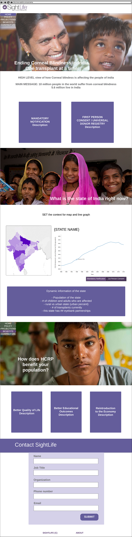
We decided to combine the map and the line chart that would display policy change of specific states of India together. At this point, we were still working on how large the map and line chart should be. We knew that these two elements had to change together and implementation along with time would dictate the end result.
The colors of the map to reflect policy implementation are pulled from the SightLife style guide.
visualizing The Map and data behind it
The key to this project was always the map and converting the spreadsheets of data we had into something more visual. On this iteration of the map:
- the India states are still shades of purple from the SightLife style guide.
- the case studies of successful policy implementation are incorporated into the map as stars that will expand into an information box
- this makes the map more interactive
- the user doesn't have to scroll to find the case studies
- the location and policy are connected
- the line graph with policy data is now within the map area in a dynamic information box that changes with what state is selected
- the map is bigger
- in the previous iteration there was a disconnect between the map and the line graph, now there is a clear connection when selecting a state and the line graph changing

The final Map
- the map with state names is now three shades of purple that represent categorical information instead of continuous
- it was confusing to see how many transplants were offered in each state, when the message we were trying to convey was whether or not policy was implemented
- the case study box is more refined with a picture, summary, and a call to action to learn more
- the line graph area has other colors from the SightLife style guide to make it stand out

SightLife Data: Turning data points into human stories
The final web page:
- Fits the look and feel of the existing SightLife pages to be easily incorporated
- bold in the images
- text that is concise while delivering a story
- Each section of the web page is clearly depicted with the use of an image and statement or question
- Introduction - Ending Corneal Blindness in India, One transplant at a time
- background information of corneal blind population and policy
- video to deliver the message of how policy implementation changes lives
- Current State - What is the current state of India right now?
- Interactive map
- Case studies of two successful areas where policy was implemented
- Line graph with policy implementation data that changes when a different state is selected, behind this line graph is a csv with hundreds of data points and a predictionalgorithm
- Interactive map
- Why - How does HCRP benefit your population?
- HCRP is the Hospital Cornea Retrieval Program
- Contact SightLife
- Introduction - Ending Corneal Blindness in India, One transplant at a time
