
Cat Lounge Case Study
For our content strategy project we focused on a cat cafe website. We individually conducted a content inventory, technical audit, competitive audit, content audit and core modeling. The purposes of these different audits was to gather supporting evidence to justify a content strategy for the business. At the end of the course we each presented one content aspect of the website we would change to better the user experience.
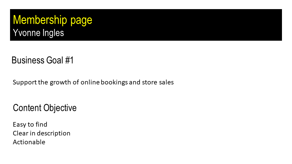
Designing a new Membership Page
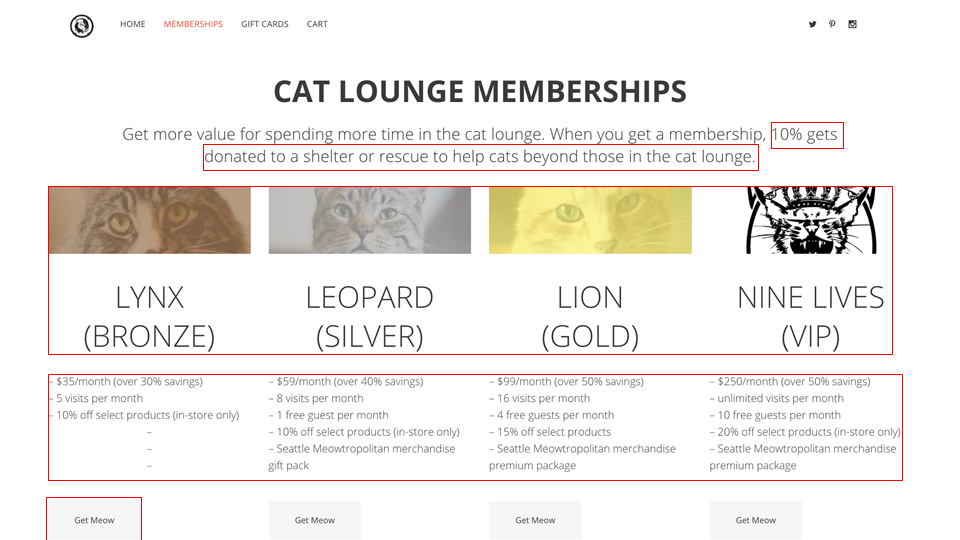
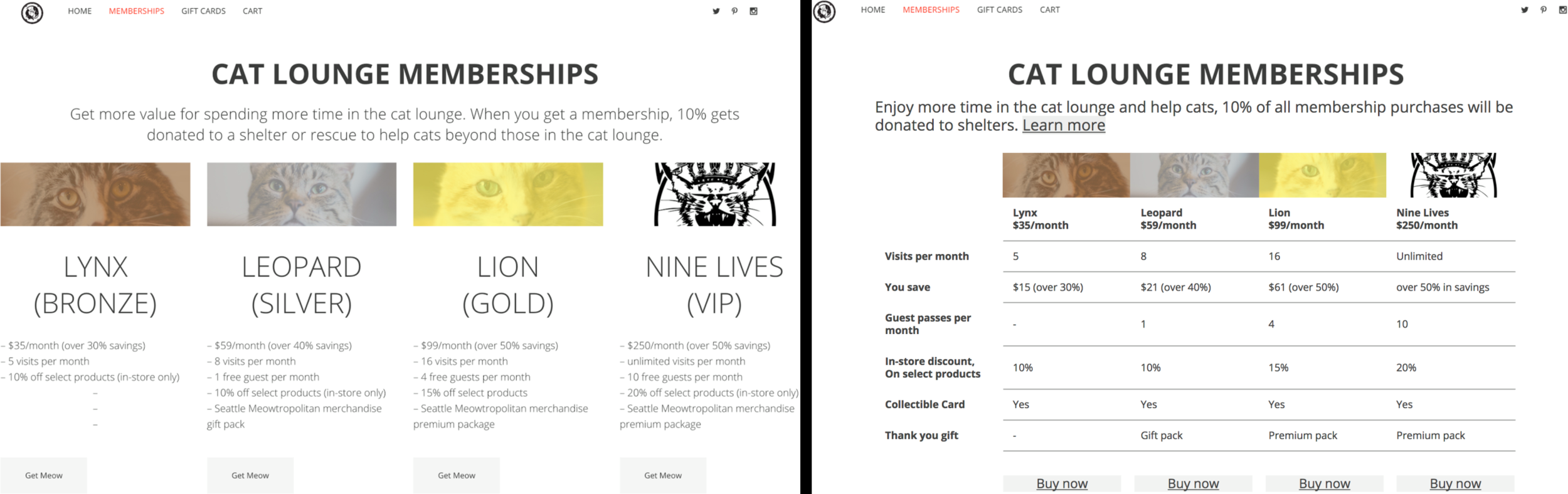
The content I focused on was the membership page. The business, at the time, had made a recent change to offer memberships. I wanted to tackle the previous table (left) because of business goal #1: support the growth of online bookings and store sales. I looked at other websites that utilized memberships and tables, and gathered the common practices between them.
Previous:
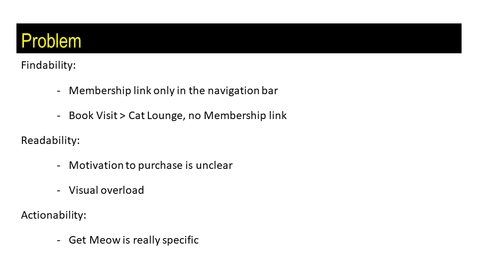
Where does the 10% go?
a customer likes donation assurance
Typography is loud and compressed
the size of the membership names, is all caps necessary?
the descriptions of the memberships are hard to read and compare with each other
Get Meow is business specific
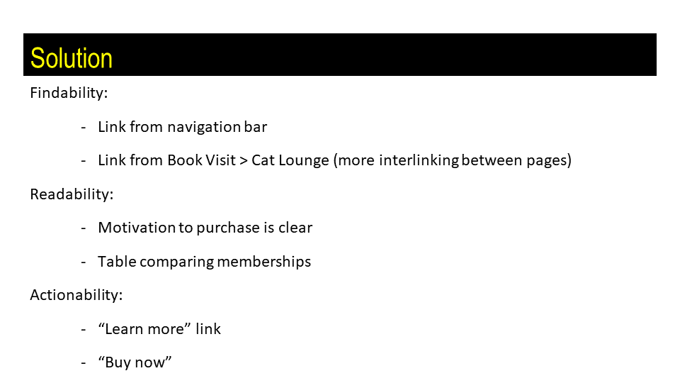
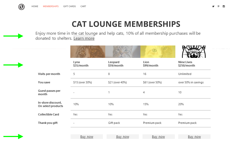
Redesign:
Create a call to action to learn more about donations (user test: a pop up with a summary of the specific donations page and a complete redirect via new window to the donations page)
Made the text the same size, but utilized bolded headings for the headings and rows of the table. Easier to compare membership levels
Changed "Get Meow" to "Buy now" a general term to buying and doesn't need specific business context
PRESENTATion Slide Deck
I created a slide deck, that was presented in class, as if I was presenting to the client. I highlighted a business goal and focused on the membership page. From the content objectives I identified the areas of content that could be fixed. I provided suggestions to remedy these problems and designed a new membership page.
SElect pages from my Discovery Report
At the end of the quarter we were tasked with creating a discovery report that highlighted key areas where the client could improve. I reported back evidence from the audits that were conducted and included screenshots of the problems areas. I then gave recommendations focused on quick fixes that could be implemented easily.
This page demonstrated the inconsistent navigation bars and an example of the modals. The different navigation bars added to user fatigue, where the user had to relearn how to get from point a to point b. The modals and the separate pages of the same information created an overload of information and added to the paths to get to the same information.
The screenshots on this page demonstrated that the web page was not suitable for mobile
This page recommended condensing the number of web pages so that each page had meaningful content and the user would have less clicks to get to key information.